Beard Oil Scent Guide
April 2, 2019 - April 17, 2019Performed a multivariate test to improve product page click-throughs, reduce bounce rates, and ultimately increase completed orders.
Duration: Two weeks
Objective: Decrease bounce rates and Increase conversion rate on product description pages.
Role: Lead UX/UI Designer, CRO Analyst
Software: Google Analytics, Hotjar, Sketch, Convert
Final Results:
Summary
One of my clients is a beard care company dedicated to providing an unbeatable customer experience. From high-quality grooming products to empowering blog content, they are a supportive group for men’s overall health, boasting over half a million followers and more than 10,000 five-star reviews.
This test was developed after discovering a large bounce rate on product description pages and subsequently a large concern over the oil, wax, and shampoo product scents. To test a potential solution to this, I designed a new system for providing this information to the user resulting in a 27% lift in conversion rate(21.51% raw conversion rate for the PDP), a 15% increase in AOV and a 26.67% increase in products per visitor.
Jump To:


Funnel Analysis
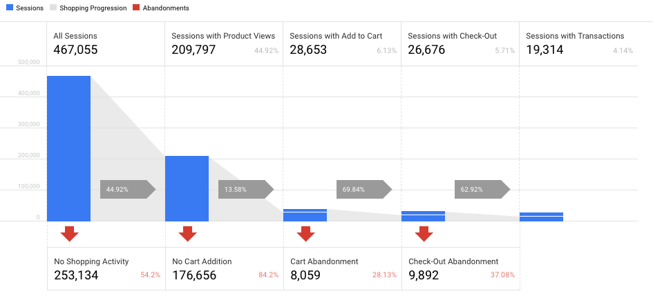
This experiment first began from a funnel analysis in Google Analytics. Based on 467,055 total sessions, about 209K (or 45%) of shoppers viewed a product during their session. From there, only 6% of shoppers added an item to their cart while 84% of shoppers bounced. Of the 28,653 shoppers who added an item to their cart, only a little over 19K completed their order (4.14% of all sessions). It was obvious the area of this funnel which needed the most attention was the product pages and cart abandonment issues but discovering why this was happening would require more information directly from the users.
Hotjar Polls and Heatmaps
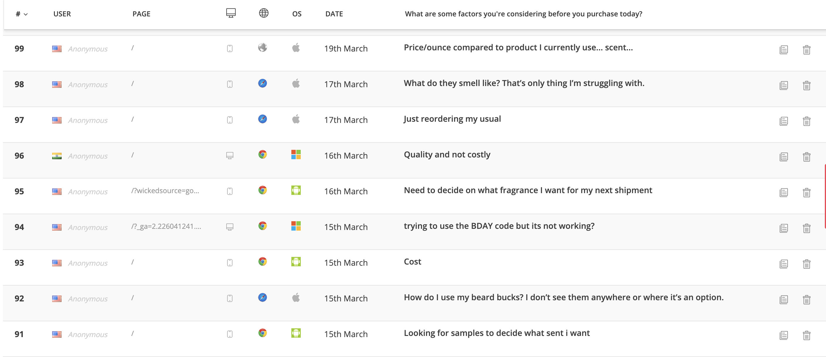
By researching heatmaps and Hotjar polls from an initial data acquisition phase (when starting with a client, I always gather as much data directly from the users as possible before testing), I discovered the main issue regarding product scent. The majority of products required users to choose a specific scent for their oil, wax, or shampoos. Of the 100 user responses we received while running a poll on the product pages, a large majority felt unsure about which scent to buy. The information was presented in its own section of the product’s description, but according to heatmaps, only 40% of users made it past the page fold where the information was presented. Even if the user scrolled this far, we still couldn’t be sure they were reading.
Test Hypothesis
Once the research was complete I settled on the final hypothesis which was presented to the client for approval:
“After observing a high bounce rate and user confusion regarding fragrance quality, we believe providing clearer access to product info for users will increase the PDP conversion rate and decrease bounce rates. We will know this when we observe an increase in products added to the cart and users viewing the checkout page.”
After approval from the client, it was time to begin designing.
Ideation
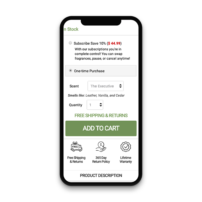
I began to brainstorm a few different concepts for how this test might work. Highlighting the scent descriptions seemed less necessary than bringing the content higher and into a stronger focal point. After a few initial sketches, I decided to placing a dynamic element near the product modifier would be the best option to test.

Testing Parameters
Since nearly 80% of this clients traffic was mobile, I knew this test would need to focus mobile-first, so that became my primary device when designing. I also needed to determine how long this experiment would run and if it was possible to test multiple variations. Based on the amount of unique visitors the average product page received, I determined we could run multiple variations over the course of 14 days. This allowed me to explore a few different options, ultimately leading to a test designed around two variations.
Variation 1:
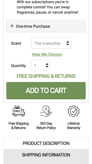
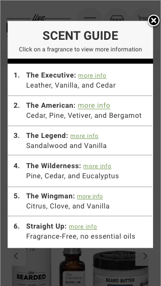
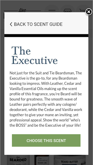
For the first variation of this test I added a hyperlink beneath the scent selector saying “Help Me Choose.” This opened a lightbox with the scent descriptions and an option to view more info. If the user clicked more info they saw the scent’s full description and an option to choose that scent – which automatically applied the selection and closed the scent guide. I was unsure if the added steps would result in higher conversions, but I knew the heatmap and user flow data received from this variation would help me in future tests.
Variation 2:
This variation put a short scent description beneath the scent selector, which dynamically change based on the chosen scent. Variation 2 was the simplest choice, as it required no extra work from the user and boldly stated the information they were searching for.

Identifying Goals and Metrics
Now that the test was designed and ready for development I needed to set proper goals in Convert based around the product page’s position in our overall funnel. Product pages identify as a mid-funnel test, so this meant using the following metrics:
- Product Added to Cart
- Decrease Bounce Rate
- Engagement
- Completed Orders
Each metric needed to be a relevant goal within our entire testing campaign, which included top and bottom funnel tests. Ultimately, based on these goals we were able to process the results after a 14 day testing period.
Results
By the end of the experiment we saw Variation 2 ultimatley pull out the strongest results with the exception of engagement – which proved users explored the novelty of the feature but were less motivated to continue through the funnel.
However, these results were exclusively on mobile. Desktop produced a null result and ultimately would require a stronger iteration.
These are the final results for all metrics across the funnel for Variation 2 on mobile devices:
Conclusion and Iterations
Since the results showed a large area for improvement on desktop, I decided this would require more research into the behavior of desktop users. I decided to continue analyzing user recordings, and heatmaps to study their behavior. In addition, I would look into the traffic and personalized goals in GA to understand as much as possible.
Regarding the winning design, we ran another series of Hotjar polls to compare with our initial discovery phase. This showed a decrease in scent confusion with the users and the test was determined a huge success for the mobile user experience. My team packaged our code and sent it to the client for implementation. The scent selector is now an active feature on the client’s mobile product pages.
Contact me and let's work together!
I’m always interested in learning about new opportunities and discussing my work within the UX community.