
Rock-N-Dirt Yard
March 1, 2018 - March 14, 2018Redesigning an E-commerce store with stronger information architecture and updated UI elements.
Duration: 2 weeks
Objective: Create an E-commerce website for Rock-N-Dirt Yard.
Role: Lead UX Researcher and Information Architect, Wireframes
Software: Adobe Illustrator, Adobe Photoshop, Axure RP
Deliverables: Low Fidelity Mockups, Clickable Prototype
Summary
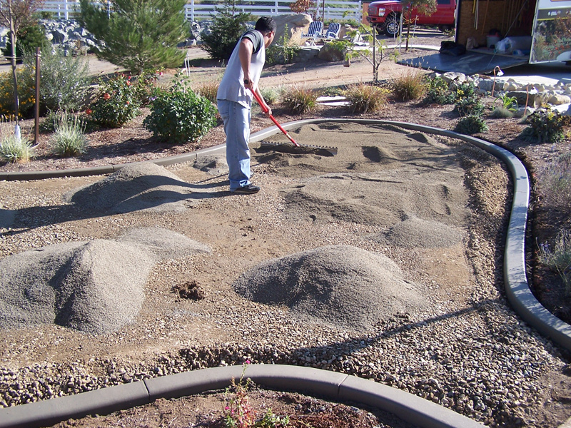
Rock-N-Dirt Yard is a landscaping supplies company located in south Austin. Their original site was cluttered, confusing, and difficult to navigate. It focused on providing information about landscaping supplies and home improvement tutorials yet neglected to show exactly what products or services the company provided. After extensive user research I determined building an E-commerce site would allow them to continue producing informational content which could ultimately drive traffic to their online store. This would increase sales and build their reputation as a market authority.
Jump to:


Understanding the Problem
The market research showed Rock-N-Dirt Yard had two types of consumers: local residents with home improvement projects and commercial landscaping companies. The current website was geared towards the former as most commercial clients operated through large scale orders over the phone. This meant our target user was a local residents. Our goal was to increase usability of the current site and provide an intuitive digital experience for users which could increase sales and improve the relationship between Rock-N-Dirt Yard and it’s current client base.
Domain Research
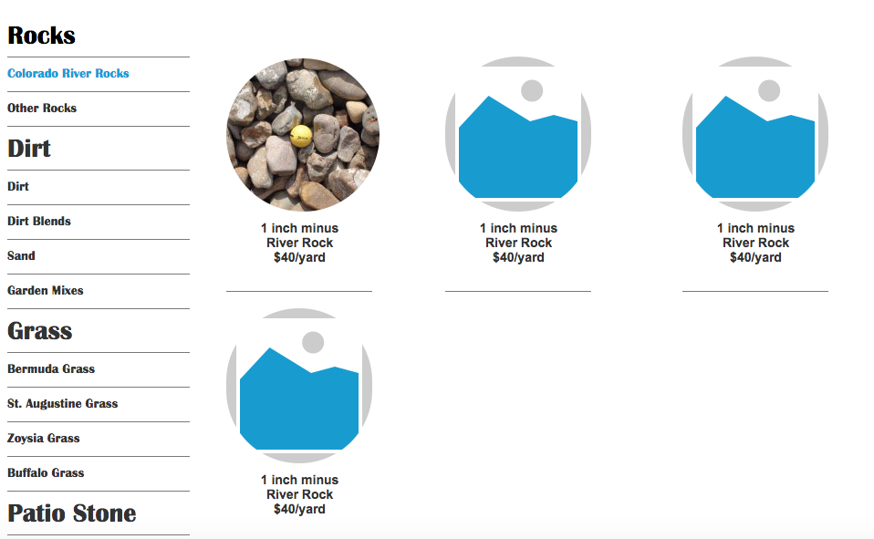
I began reviewing the Rock-N-Dirt Yard website. Aside from my initial distaste for it’s visual design I felt lost, confused and unable to focus. There were several items competing for the users attention. This included landscaping tutorials, office information, blog updates and a “material calculator.” Finding the right information to focus on was key. You can view a quick screenshot below:

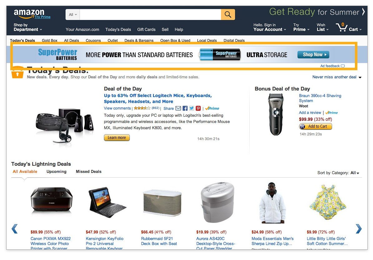
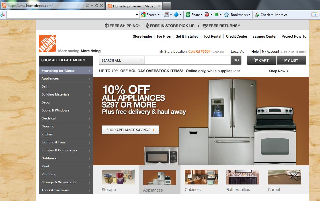
Competitive Benchmarking
To determine what most landscaping material sites focused on, I explored several competing websites. I looked at Home Depot, Lowes, and even Amazon in addition to several smaller landscaping businesses. The biggest difference between most competitors was a strong focus on their products. Rock-N-Dirt Yard believed most consumers would come to their site for information either about the business or about landscaping projects. To know for sure I needed to meet with actual customers.
User Interviews
I visited Rock-N-Dirt Yard to interview several customers but wanted to branch out and understand what the general home renovator needed. I visited several stores like Home Depot and Lowes, but the most informative was The Great Outdoors which is located on South Congress and features a similar business concept. I primarily wanted to know whether consumers would purchase their supplies from a website and if they used any online resources for their personal projects. I needed to understand what was viable about an e-commerce store and what my user motives and pain points may be.

Persona and Pain Point Discovery
Based on the market and user research I was able to develop a persona which accurately fit our target user.

Elaine was a woman in her late 40’s who enjoyed gardening and home renovation projects. Similar to other users, she wanted to feel informed about her materials which meant buying products up close and personally. She didn’t trust online stores to accurately provide the proper detail and felt by touching and seeing these materials in person she could inform herself. Inspired by HGTV, PBS or other landscaping videos online she was referencing project tutorials from one source and purchasing items from another. This led me to my final solution.
The Solution
By increasing a focus on their current Youtube following Rock-N-Dirt Yard could drive traffic back to their website to purchase the materials featured in their videos. This would consolidate Elaine’s resources and provide the integrity needed to purchase supplies through an e-commerce store. My deliverable would be a website dedicated to the products with traffic driven from their online videos.
Information Architecture and Card Sorting
One of my biggest concerns when entering the design phases was understanding the proper taxonomy. Questions like, “Do users consider sand to be rocks or dirt?” became a difficult obstacle. Using Optimal Workshop’s card sorting tools, I was able to consistently test my organization with users. This allowed me to confidently develop the new information architecture of Rock-N-Dirt’s store.

Sketching
After the proper taxonomy was in place I began sketching. I went through several iterations before deciding on a simple concept. I returned to the data in my competitive research phase and attempted to imitate some of the stronger features I found on Home Depot and Lowes. I also attempted a couple logo redesigns but felt that was unnecessary in the end.
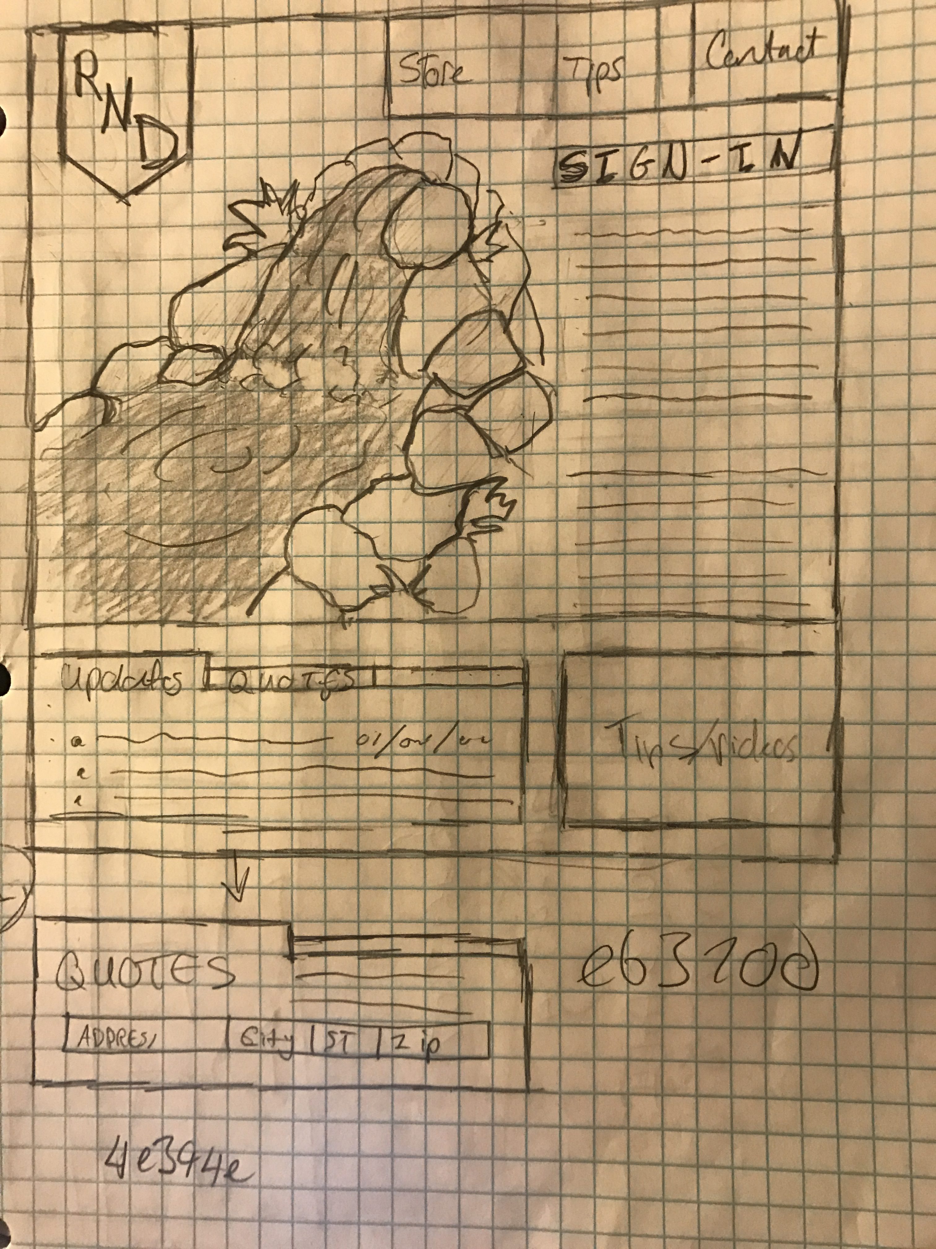
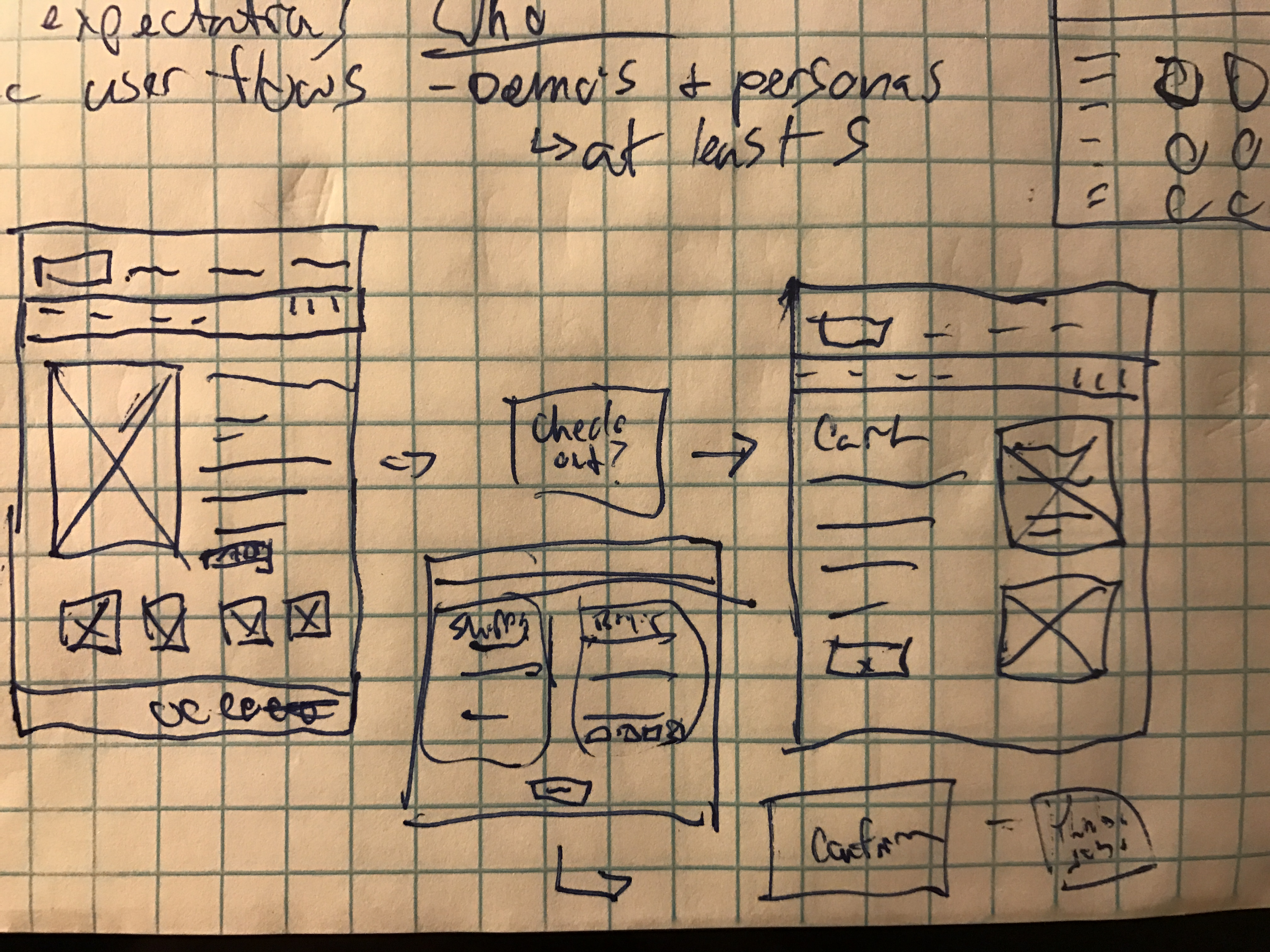
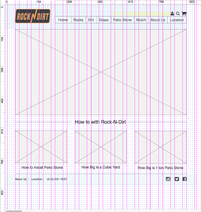
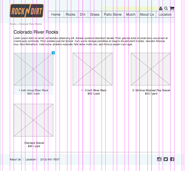
Wireframes
Once my sketches were complete I moved to Axure RP to begin the development of wireframes. Each page was developed using a 12 column grid. After a few low fidelity mockups I created a simple user flow and moved into user testing. Up until this point everything felt conceptual and I needed to see if my taxonomy and layouts worked with real users.
Mid-Fi Prototype
I tested a few of my user flows with various users who fit my persona. I added images on some of the necessary elements as well. Unfortunately, my first round of user testing came back with a fair amount of negative comments. A few of the main issues discovered were:

1. Users did not know how to login.
2. Users felt item navigation page was redundant considering they could navigate with the header.
3. There was nothing on the landing page indicating a connection to Rock-N-Dirt’s videos.
Iterations
I went back into Axure and reorganized my layouts. Keeping with the 12 column grid I developed a new concept for the landing page. This would prominently feature certain products in addition to the latest Rock-N-Dirt Yard videos. I also redesigned my item navigation and allowed for a simpler checkout process. Finally I replaced the login icon with one more commonly affiliated with account profiles.
New Wireframes
Conclusion
With my iterations I tested the new design to find incredibly positive reactions from all users. The site felt informative and easy to navigate. Users clearly new how to login, and where to access the information they needed. I also provided a feed to showcase the latest Rock-N-Dirt Yard videos to help strengthen brand identity. The main goal to create a store which reinforced their market authority and encouraged users to buy their products was apparently successful. The next step will involve high fidelity mock-ups and ultimately development. I also believe creating a blog for the site to increase SEO would be important in the future. Below I put together a quick high fidelity mockup demonstrating how the final design might look.

Contact me and let's work together!
I’m always interested in learning about new opportunities and discussing my work within the UX community.