Broomly Inc.
July 10, 2017 - July 28, 2017
Redesigned the information architecture and interface of Broomly’s CRM software. A stylesheet and terminology guide were created in addition to a high fidelity user-tested prototype.
Overview
Duration: Three weeks
Objective: Redesign Broomly’s CRM software for easier scalability.
Role: Lead UX Researcher and Information Architect, Visual Designer, Client Manager.
Software: Axure, Adobe Illustrator, Google Suite, Slack
Deliverables: Style and terminology guide, clickable hi-fi prototype, marketing one-sheet.
Summary
Broomly is a company providing home maintenance services. This primarily includes cleaning and yard detail but as the company expands, so do client options. In order to keep up with this expansion, they have created an in-house CRM software which serves the needs of management, employees, and customers. We were asked to streamline the current software to make existing features as intuitive as possible for new users. The redesign was expected to make the system scalable and sellable.
Jump to:
Research
Contextual Data
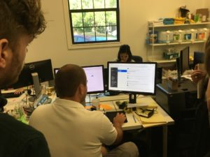
We began by mapping out several user flows and asked each employee to demonstrate common tasks and scenarios. Most employees interacted with several different windows across dual-screen monitors in order to accomplish seemingly simple tasks such as scheduling a new maid or canceling service. The contextual data gained through this process became pivotal in our redesign of the information architecture.
User Interviews
We decided to set appointments with both employees and clients to understand their perspective of the software through user interviews. Finding both old and new users was important for determining the scope of our project. A few points included in the interviews were:
1. What are the prioritized functions that need to be included for optimal system functionality?
2. What is the current learnability of the system, and how can we improve and streamline this for new clients?
3. How will new and future companies be expected to interact with a system they are unfamiliar with?
Heuristic Analysis and Competitive Benchmarking
Following the round of user interviews, I began a strong internal audit of the Broomly system, in addition to an analysis of relevant competitors. I established a list to understand how these companies were approaching similar features and functions.
Pain Point Discovery
After discussing our research we decided to focus on three main objectives:
1. Create a consistent list of terms and hierarchies to streamline the information architecture.
2. Establish a style guide to create an intuitive user experience.
3. Streamline user flows without isolating old users already familiar with the system’s structure.
Design Process
Style Guide
As we began the design phase a style audit was conducted to create a standard for the terminology and visual elements. Consistent language and style were important to minimize confusion and create an intuitive experience for old and new users.
View the Style and Terminology Guide
Site Map
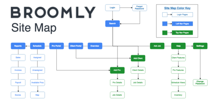
In addition to the style guide I began creating a series of site maps and user flows to guide the visual design process. Several iterations were developed before deciding on a final system.
Sketching and Wireframes
With the site map created we were able to begin sketching and prototyping while ensuring major functions and flows were given the necessary priority. During this phase we conducted several user tests with new and veteran users to create complete clarity for Broomly’s new user experience.
User Testing
Prototyping
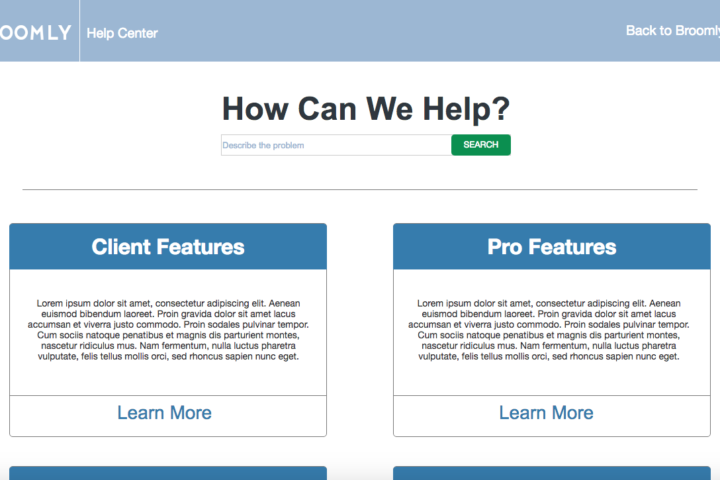
After each page was sketched, and converted to a wireframe we began user testing with low fidelity prototypes. Using Axure, I created new interactions for the Dashboard and Schedule pages and designed a Help section with articles for new users. During this phase we discovered more iterations which allowed us to streamline user flows.
Iterations
As we reached our first deadline with the CEO we delivered a presentation demonstrating the new clickable prototype. Our user testing provided data showing the new system was easily adapted by old users while minimizing the learning curve for new users.
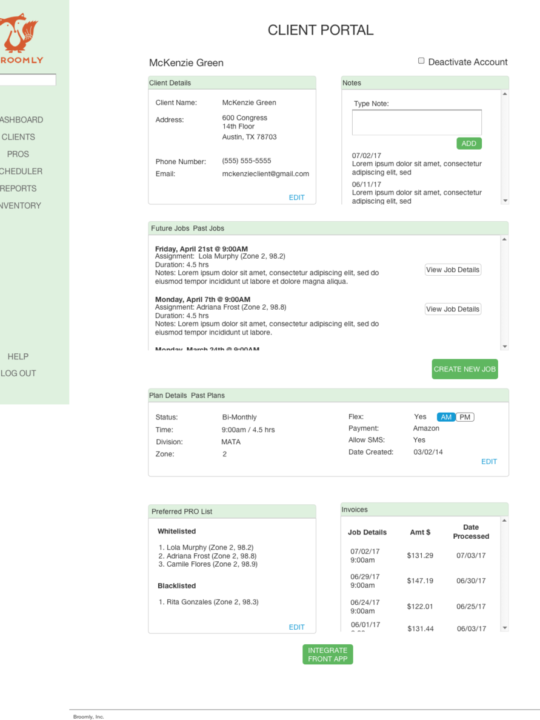
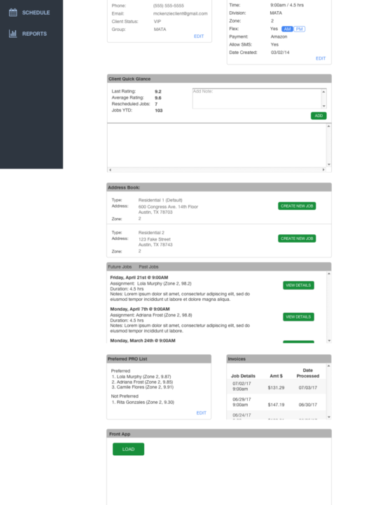
After receiving feedback from the CEO it was important to incorporate his ideas with our current designs. We decided to pivot and blend both the original software’s style with our new taxonomic structure. Below is an image depicting the new client page from our original design before pivoting.
Results
Final Prototype
The improved design intuitively drove users toward the most efficient user flow while maintaining many of the original style elements. Some of the new features included:
1. Dual toolbars (navigation on the left, action widgets on the top)
2. The addition of customer and employee portals.
3. A dashboard displaying relevant information to the targeted user.
Deliverables
As we ended our three week sprint, we applied all iterations from user testing and created an updated prototype. Our new concept remained loyal to the brand identity while streamlining the most important user functions. Below is a video demonstrating several user flows through the redesigned software.
Conclusion
By the end of the project, elements of the original system were still apparent, but this revision allowed for a more direct and intuitive experience. Through our process my team was able to quickly and efficiently work together to deliver this MVP and produce a high fidelity prototype which after further user testing, was proven to significantly reduced on-boarding time and provide a cleaner more approachable product for investors.
Contact me and let's work together!
I’m always interested in learning about new opportunities and discussing my work within the UX community.
