
ImpressionsApp Concept
Feb 2, 2017 - Feb 7, 2017Research, designed, and prototyped a closet organizing app concept. Most apps catologue your clothing but none create new looks with your existing items. The app is designed to inspire users to try new styles and outfit combinations based on what's in their closet.
Duration: One week
Objective: Help users catalogue their clothes and provides outfit suggestions.
Role: Lead UX Designer
Software: Adobe Illustrator, Adobe XD
Success Metrics: An app which inspires users to be creative with their clothing.
Summary
As a personal project I chose to make a closet organizing app. My friends and I own many clothes but gravitate towards a select few when planning for the week. Occasionally they might find clothes they forgot they owned or realize certain items pair with others they never considered. I saw a problem with organization and perspective, and wanted a solution to mediate this.
Jump to:


Understanding the Problem
After researching several closet organizing apps, and speaking with users who identified as being disorganized with their wardrobes, I determined a solution. Provide an app to catalogue clothing and assemble outfits.
Surveys and Interviews
Beginning my research, I surveyed friends, family, and coworkers to determine their relationship to my problem. Some of the questions included:
- How do they organize their clothes?
- How do they choose an outfit?
- What part of the process was difficult when choosing an outfit?
Results showed that most people organize by season or style but some organized by color or brands. The only difficulties in choosing an outfit were related to a lack of wardrobe. People wanted to purchase new clothes because they were bored with their current looks. I felt this could be remedied with a more creative solution so I began looking at similar apps for further research.
Competitive Benchmarking
Related apps on the market included Smart Closet, Closet+, and ClosetSpace. Each of these contained a variety of different features. Closet+ allowed you to create or add to new categories for your clothing. Each individual item also included descriptive information plus a photo. Some even allowed you to purchase clothes from your favorite stores through their app and add them to your virtual closet. This would be a nice feature but distracted from the success metric and ultimately fell out of scope.
Smart Closet also offered a Calendar feature, which I felt could be built into my application as well. At first this feature felt unnecessary but ultimately I decided would benefit users by encouraging them to plan their outfits. Having a travel or suitcase feature would also be beneficial. With the information from user interviews and competitive research I needed to move to site mapping and information architecture.
Ideation
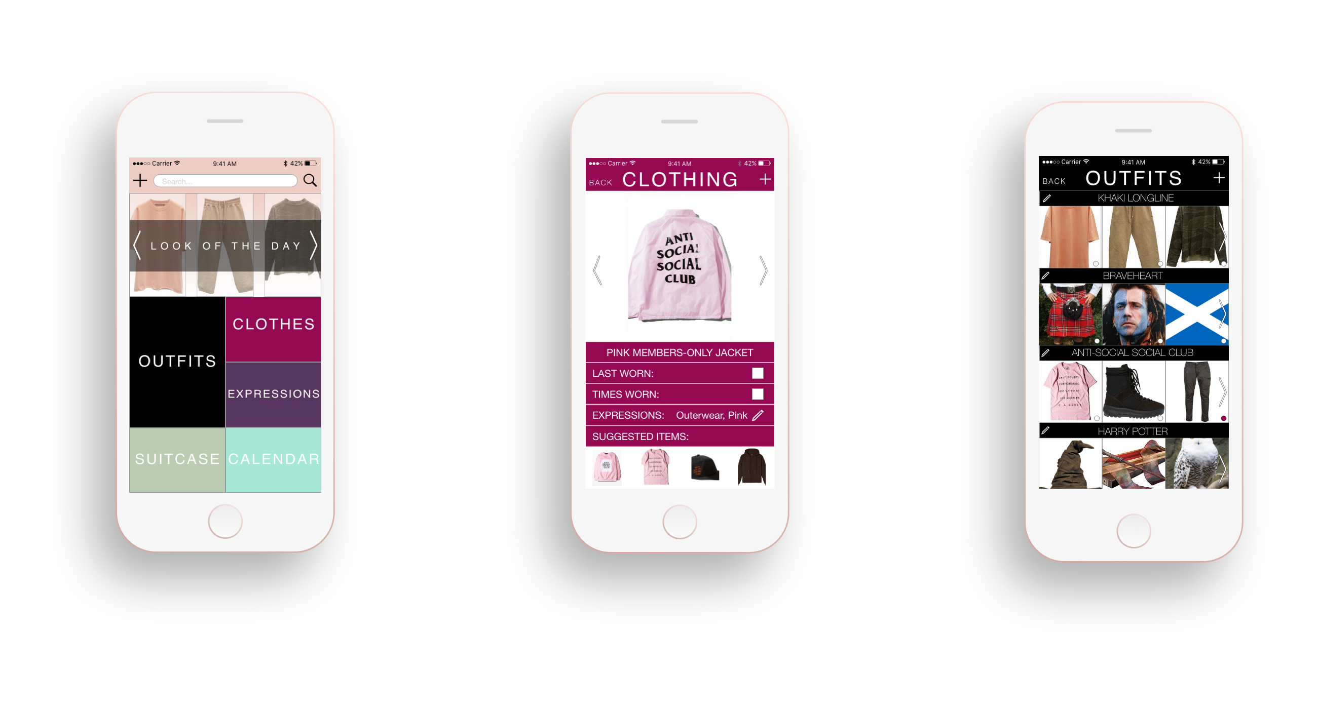
The major problem I saw when beginning this process was an issue with creativity. Users not taking the time to explore their closets. Each of the apps on the market solved an organization problem, but never addressed the creative issue. I knew the proper information architecture, but I wanted to add something innovative. This led to the “Look of the Day” and “Expressions” features.
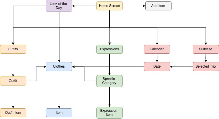
”Expressions” features preset style categories like shirt, pants, shoes etc. in addition to personalized categories which the users could create. By adding new items to the preset styles, a random outfit is generated within the “Look of the Day” feature.
This would be displayed on the home screen, with a different arrangement every 24 hours. Potentially a settings category could be added, allowing for this time limit to change. If users created their own “Expressions” those would be excluded from the “Look of the Day” function.
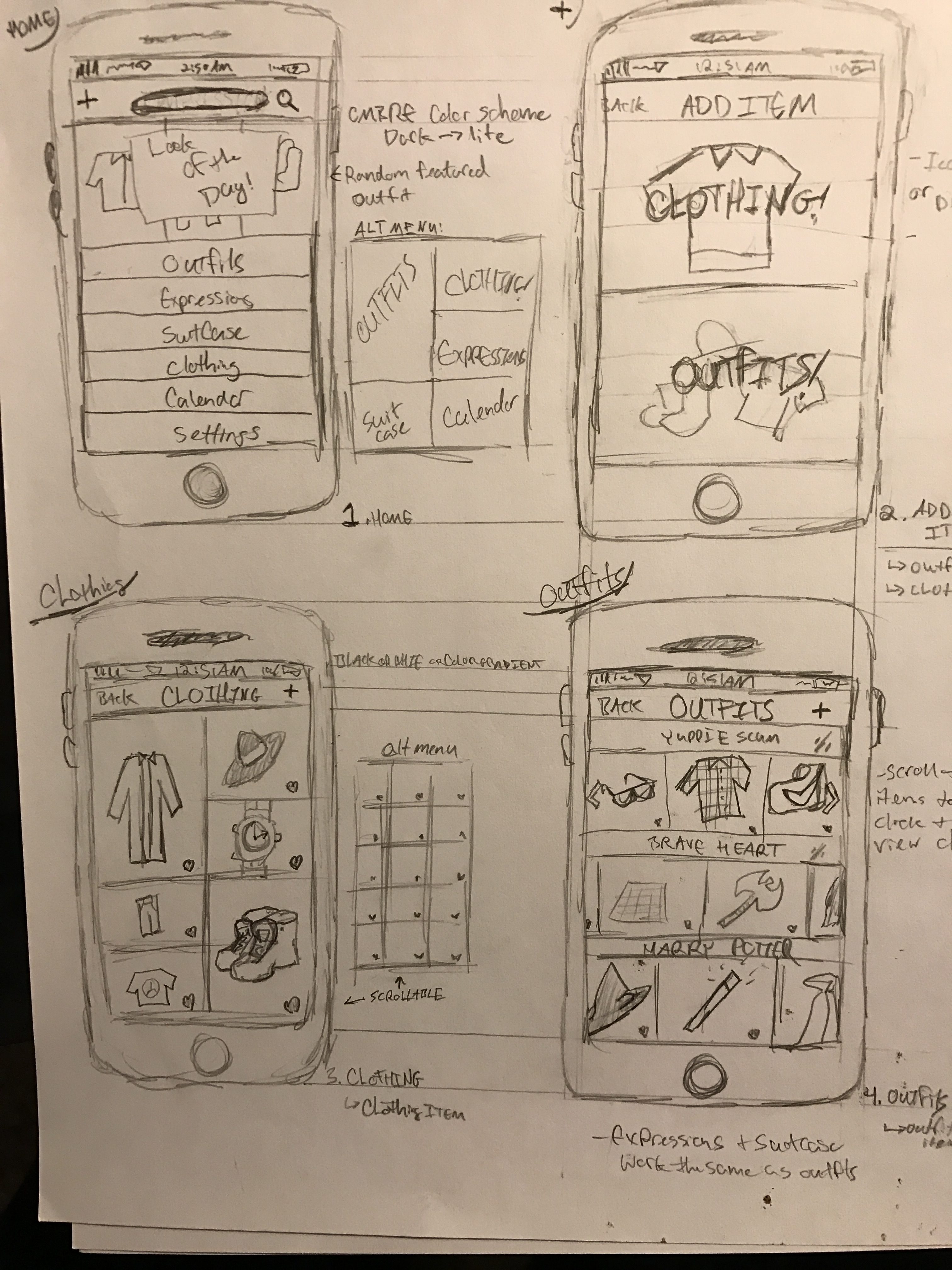
Sketching
From here I proceeded to sketch out my basic concepts. For the initial prototype, I found no reason to prioritize each section of the app and listed them all with equal importance. I borrowed the descriptive information for each item from the Closet+ app, and organized the clothing section with a basic grid.
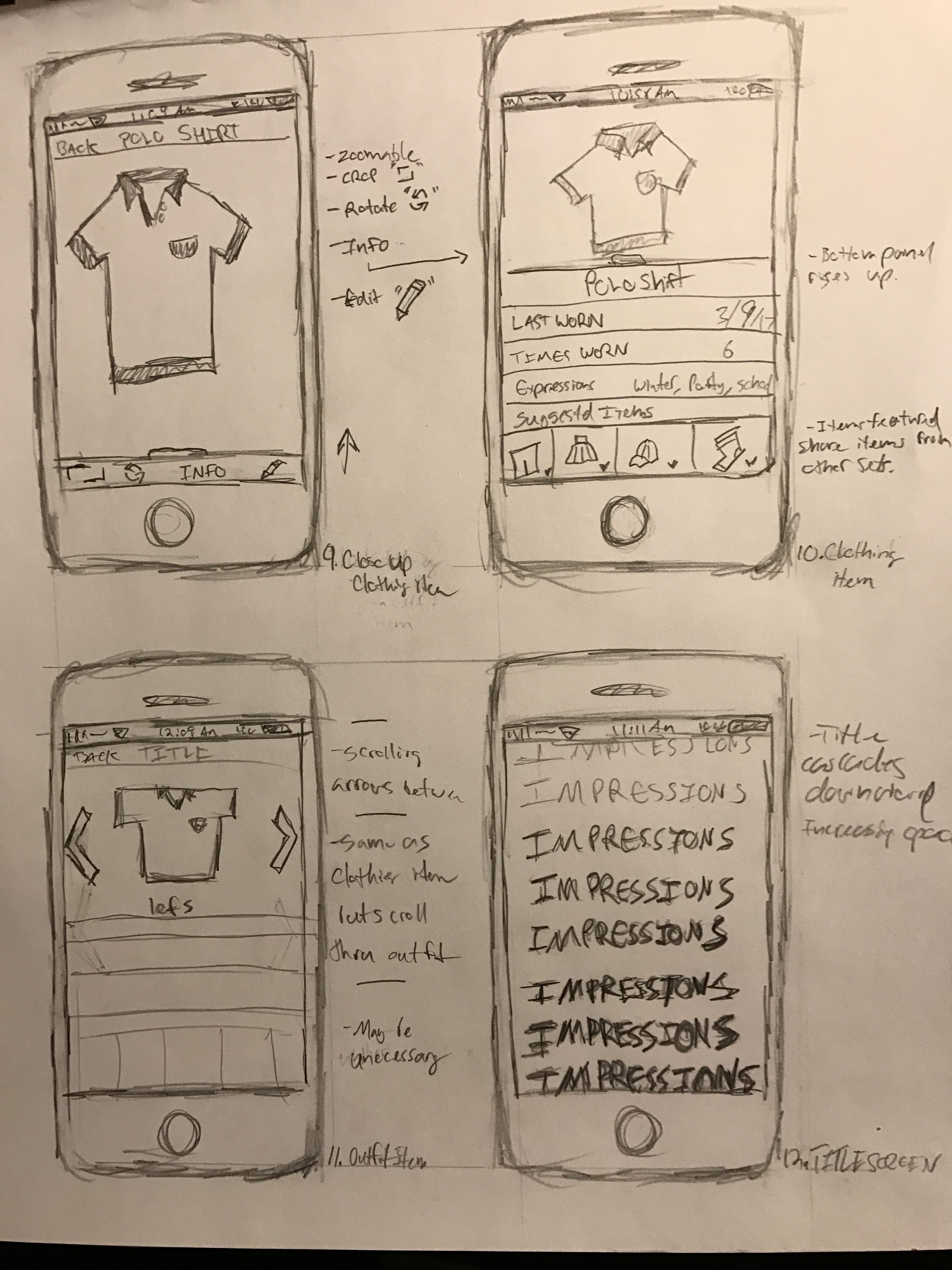
Wireframes and User Testing
After rough sketches were developed for each section, I moved to wireframing. One iteration made in this phase was a change in the home screens taxonomy, primarily the emphasizing the “Outfits” section. In the testing phase most users were unsure what sections to click first and admitted to feeling immediately overwhelmed. I enlarged the outfits section and placed the subsequent sections in smaller boxes.

High Fidelity Mockups
When it came to choosing color schemes, I wanted the user experience to feel more expressional than utility and I debated sticking with white and black. My final user tests with this design forced me to create higher contrast between colors on the main page.
Final Iterations
Ultimately, I chose a color palette which I thought balanced strong, muted tones and chose Helvetica as the primary font. I’ve provided a video demonstrating several user flows below.
Conclusion
As someone who enjoys fashion and creativity, this project was incredibly fun to work on. I set out to solve a problem with wardrobe creativity and utilizing the “Look of the Day” feature accomplished that. I would prefer to have more rounds of user testing, but within scope managing about five for both the wireframe and high fidelity prototype fit my time frame. Overall, I’m proud of the work I put into this project and hope to revise this into a fully functional closet-organizing app.
Contact me and let's work together!
I’m always interested in learning about new opportunities and discussing my work within the UX community.